The article explains modern data-driven content improvement as a dual-layer system tracking classic funnel metrics and AI-visibility signals like citation frequency and structured-data health. It defines a full KPI taxonomy, shows how to consolidate GA4, Search Console, and CMS data into a focused 10-15 metric dashboard with cadence and alerts, and details a Diagnose-Decide-Execute loop plus Impact/Effort prioritization.
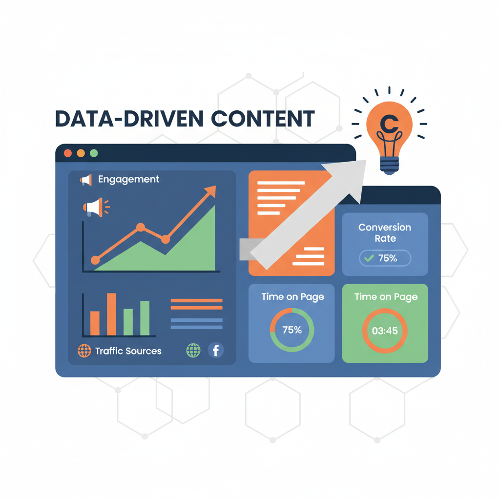
Data-driven content improvement means using defined metrics and a unified dashboard to decide which articles to fix, promote, or retire, and in 2026 that system has to track both classic funnel performance and whether content is actually cited or surfaced in AI answer engines like ChatGPT, Perplexity, and Google AI Overviews. An article can look healthy in GA4 yet be invisible where buying decisions now start, which is why the two layers have to sit on the same dashboard rather than in separate reports. For years ranking and visibility were the same objective: earn a position in Google, earn the click, measure the result in analytics.
Generative search breaks that chain. Answers are synthesized from multiple sources and often delivered without a click, so traditional engagement signals cannot show if a model considered your page authoritative, recent, and well-sourced enough to include. A blog can hold its organic traffic while losing share of model answers, which means the old dashboard reports success while discoverability quietly declines. Closing that gap requires treating AI citation, referral patterns from assistants, and citation-readiness of each page as first-class metrics alongside traffic and conversion, not as an afterthought. That shift also makes how pages connect matter more, which is why internal linking and topical clustering for AI search is now a measurement concern rather than just an SEO tactic. That framing raises the obvious next question: which specific metrics belong in this system, and where do they come from?
The full KPI taxonomy for data-driven content improvement includes two measurable layers: classic funnel metrics that show if content earns attention and converts, and an AI-visibility layer that shows if answer engines can find, trust, and cite it. What's missing from most dashboards today is the second layer entirely.
Funnel metrics remain the baseline for traffic and business value. Awareness starts with search visibility: impressions count how often someone saw a link to your site on Google, alongside clicks and sessions that show whether visibility turns into visits. Engagement shows whether people actually read: GA4 defines user engagement as the amount of time someone spends with your web page in focus or app screen in the foreground, which powers average engagement time and engaged sessions, while scroll depth and read percentage reveal completion. High impressions with low clicks usually means a title or intent mismatch; high engagement with low conversion points to a weak next step.
The AI-visibility layer answers a different question: is dashboard-healthy content invisible to AI? It adds citation or mention frequency in AI answers like ChatGPT, Perplexity, and Google AI Overviews, referral traffic segmented by AI assistant where server logs or analytics expose it, structured-data and schema completeness, content freshness and last-updated signals, and source-citation density per article. Low citation frequency despite strong funnel numbers often means content is readable but not structured or sourced for extraction. Building that density can depend on partnerships that earn credible citations safely, which improves both human trust and machine parseability.
| Metric | Layer (Funnel or AI-Visibility) | What It Tells You | Typical Data Source |
|---|---|---|---|
| Organic Impressions | Funnel - Awareness | Whether your pages are surfaced in search | Google Search Console |
| Organic Clicks / Sessions | Funnel - Awareness | Whether visibility converts to visits | Google Search Console / GA4 |
| Average Engagement Time | Funnel - Engagement | If readers stay focused on the page | GA4 |
| Scroll Depth | Funnel - Engagement | How far readers progress through article | GA4 / Webflow analytics |
| Read Percentage | Funnel - Engagement | Estimated completion rate of article | Content analytics / scroll tracking |
| CTA CTR | Funnel - Conversion | Whether content drives the intended next step | GA4 / CMS events |
| Form Conversions | Funnel - Conversion | Leads generated from content | GA4 / CRM |
| Revenue Attribution | Funnel - Conversion | Economic value tied to article | GA4 / attribution tool |
| AI Citation Frequency | AI-Visibility | How often article is cited in AI answers | Manual GEO tracking / GEO tool |
| AI Referral Traffic by Assistant | AI-Visibility | Visits arriving from ChatGPT, Perplexity, Copilot, etc. | GA4 referrers / server logs |
| Structured Data / Schema Completeness | AI-Visibility | Whether content is machine-extractable | CMS audit / Rich Results Test |
| Content Freshness / Last-Updated | AI-Visibility | Recency and maintenance signals for trust | CMS / sitemap |
| Source-Citation Density | AI-Visibility | Number of authoritative external sources per article | CMS content audit |
Defining the right metrics is only half the job; they need to live somewhere a team actually checks.
Building the content performance dashboard means consolidating Google Analytics 4, Google Search Console, Webflow CMS analytics and optional AI-referral signals into a single Looker Studio or BI layer that surfaces only 10-15 KPIs per audience view to avoid overload. That view pulls engaged sessions and source data from GA4, impressions, CTR and position by page and query from Search Console, and publish date, schema completeness and citation density from the CMS, with AI-referral splits added where server logs expose assistants like ChatGPT or Perplexity.
Connect GA4 via its native connector, Search Console via the Search Console API or Looker Studio connector, and Webflow CMS fields via export or API, so each URL has one row joining traffic, search and content health.
Keep views focused with the pyramid approach: a top executive row of scorecards, a middle trend layer using line charts for trends over time, and a bottom detail layer using bar charts for comparisons and tables. Creating separate views for content, SEO and leadership prevents overload, a practice reinforced by GA4 guidance to limit to 10-15 key metrics per view.
Set cadence intentionally: use weekly and monthly views in Search Console to clean daily noise, reviewing engagement and technical health weekly and AI-visibility or citation metrics monthly. Configure alerts for divergence patterns such as rising impressions but falling engagement rate, or an engaged-sessions drop of 20% week-over-week, plus a flag for pages with sustained impressions and zero AI citations after your defined window.
A dashboard with the right KPIs but no defined review cadence and alert threshold is just a report nobody acts on. The cadence and thresholds are what make it data-driven rather than data-decorated.
Documenting sources and freshness as part of evidence-based quality control keeps the dashboard actionable. Spotting the signal is step one, turning it into a specific content fix is the loop that actually improves performance.
The Content Iteration Loop is a four-step operational system (Diagnose, Decide Fix Type, Execute, and Re-measure) that converts a dashboard flag into a live content fix within a single sprint.
Read the pattern, not just the number. High impressions with falling CTR plus high scroll depth usually points to intent mismatch in the intro, not lack of interest. High traffic with low time-on-page and low next-step clicks points to friction after the hook. Zero presence in AI answers despite healthy organic traffic points to a structure and sourcing problem. Pages that fall into that last bucket also tend to lose citations at a higher rate when left unrefreshed compared with pages kept on a regular update cadence, which is why AI-visibility failures rarely resolve with a copy tweak.
Match the diagnosis to one explicit action so execution stays scoped:
Ship the smallest fix that addresses the diagnosis, publish, then compare the same metrics that triggered the flag over the next 30 to 60 days. This is where teams use automation for the rewrite-and-republish half of the loop. For example, HarperFlow acts on the diagnosed gap by researching, sourcing, and republishing the article with citation-rich structure, closing the loop between dashboard signal and fixed asset without manual drafting.
With a working loop in place, the last piece is knowing what to fix first when every dashboard has more red flags than time to act on them.
Prioritizing content fixes with limited editorial time means ranking every flagged article by expected business gain divided by fix effort, with high-traffic pages that earn zero AI citations at the top because they offer the largest compounding upside as AI answers capture more query volume.
HarperFlow publishes highly structured articles featuring FAQs, data tables, and direct-answer blocks that meet the rigorous citation standards required by AI search engines. By continuously auditing and improving your content through AI answer analytics, HarperFlow helps your site build long-term authority and visibility that outlasts ad-dependent strategies.
Every dashboard eventually surfaces more problems than a team can fix at once. Use a simple Impact / Effort score for weekly triage:
For a faster visual, plot the same backlog on a 2x2. Traffic Level on one axis, AI-visibility Gap on the other. High traffic with large visibility gap gets fixed first. Low traffic with low gap gets retired or merged. The other two quadrants get queued by effort.
Operationalize it so the choice sticks. Run the scoring review once a month, assign a single owner in content ops to maintain the backlog and publish decisions, and track one compounding signal: AI-citation rate rising month over month while classic organic sessions and conversions hold steady or grow. Once the queue is set, HarperFlow can act as the execution layer, taking the prioritized pages and rebuilding them with citation-rich structure so the signal turns into published fixes without manual editorial work.
If referrer data is blank, use proxy signals from the AI-visibility layer like structured-data completeness, source-citation density, and manual citation checks in assistants, plus server log analysis where possible. The system still works when you treat those as first-class metrics even without perfect referral splits.
Combine them at the URL level so one row shows both classic performance and AI signals, which lets you spot divergence like strong organic clicks with zero citations. You can still create separate views for leadership, SEO, and content, but keep the underlying data joined to avoid false healthy signals.
Keep each audience view to 10-15 key metrics to avoid overload, as recommended in GA4 dashboard best practices. Use the pyramid: scorecards on top, trends in the middle, and detailed tables at the bottom.
Use line charts for trends over time to track impressions, engagement time, or citation rate month over month. Use bar charts for comparisons between categories like top articles, authors, or traffic sources.
Start with one actionable flag like a 20% week-over-week drop in engaged sessions, which is a documented example threshold. Add divergence alerts such as rising impressions but falling engagement rate, then tune thresholds to your baseline after a month.
Review engagement, CTR, and technical health weekly, and use weekly and monthly views in Search Console to smooth daily noise. Check AI citation frequency and referral by assistant monthly, since model behavior shifts slower than search results.
GA4 counts user engagement as the amount of time someone spends with your web page in focus or app screen in the foreground. Time when the tab is in background does not count, so it is stricter than total time on page and better reflects actual reading.
Impressions means how often someone saw a link to your site on Google, so high impressions with low clicks usually signals a title or intent mismatch. Zero citations on top suggests the page is readable but not structured or sourced for extraction, so prioritize fixing the intro, citations, and schema.
Related articles
HarperFlow publishes highly structured articles featuring FAQs, data tables, and direct-answer blocks that meet the rigorous citation standards required by AI search engines. By continuously auditing and improving your content through AI answer analytics, HarperFlow helps your site build long-term authority and visibility that outlasts ad-dependent strategies.
Start Your Trial TodayLover of all things automation and all things content.
Your privacy
Necessary storage keeps the site secure and working. With permission, analytics helps us improve it and marketing tools measure campaigns. Google can still send limited cookieless signals when optional storage is off. Read our Privacy Policy.
Your browser sends a privacy signal (Global Privacy Control), so optional technologies start off — your choice here takes precedence.
Privacy choices
Necessary storage supports security, consent, and the features you request. Optional categories can be changed at any time.
Security, fraud prevention, consent preferences, form delivery, and popup suppression.
Your browser sends a Global Privacy Control signal, so optional technologies start off by default. Your explicit choice here takes precedence.
A practical AEO/GEO manual for making your Webflow site clearer, better sourced, and easier for answer engines to use—without gimmicks or guarantees.
Find gaps in discovery, extraction, evidence, authority, and freshness
Use evidence patterns, briefs, and fill-in worksheets
Run a focused 30-day AEO/GEO operating sprint
We’ve emailed your copy. It should arrive within a few minutes.
If it is not in your inbox within a few minutes, check spam or promotions.