This article defines an accordion design template as a stack of five parts—container, header trigger, label, state icon, and panel—and explains single- versus multi-expand behavior. It maps patterns to jobs like FAQ, pricing, specs, and navigation, details W3C ARIA requirements for buttons, aria-expanded, and keyboard interaction, shows a no-code Webflow build, and advises when to avoid accordions for scannability and SEO.
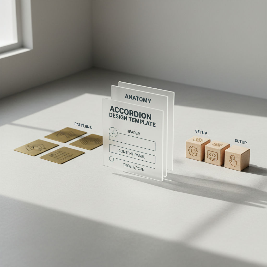
An accordion design template is a UI pattern that fixes the problem of long FAQ or spec pages losing readers halfway through the scroll: a vertical stack of collapsible containers that toggles content visibility to save space and lets people reveal details only when they need them. In its basic form the template pairs five parts: a container that groups the list, a trigger or header row users interact with, a short label that previews the content, a state icon like a chevron or plus/minus that signals open versus closed, and the hidden content panel itself.
Some templates allow only one panel open at a time, while others support multiple open panels at once. That single- versus multi-expand choice changes how people compare answers, and it sets up the decisions around labeling, animation, and accessibility covered next. Keeping those parts labeled with clean, crawlable markup also preserves semantic content architecture for both humans and search parsers.
Each of the five parts (container wrapper, header/trigger control, label/title, state icon, and content panel) carries a functional job beyond decoration. Get one wrong and the whole pattern feels broken even if it looks correct.
Container / root. The outer wrapper stacks items vertically and defines grouping, dividers, and spacing. In Material UI's spec the component consists of a root div that contains summary and details elements, establishing that hierarchy explicitly.
Header / trigger. This must be a real interactive element, not a styled div. Carbon Design System defines the header as containing the section title and serving as the control for revealing the panel, which means it needs button semantics to be focusable and activatable.
Label / title. The text inside the header gives the high-level overview that lets a person decide whether to expand. Carbon recommends titles stay brief yet descriptive and map to the page heading structure.
State icon. Usually a chevron or plus/minus, it signals state at a glance. Carbon notes the icon indicates if the panel is open or closed, with chevron down for collapsed and up for expanded, and Material UI handles the turning upside-down transition automatically to keep feedback consistent.
Content panel. The associated section that shows or hides. Carbon describes the panel as the section of content associated with a header.
Abrupt open/close without motion feels broken because the eye loses context. Both systems apply a short eased height transition by default and expose transition props to adjust it, so content appears to unfold rather than jump.
Stripe keeps each help article independently openable while its sidebar navigation forces one section open at a time, and that contrast captures the accordion design template rule: FAQ lists favor multi-expand, navigation favors single-expand. The static anatomy above has to flex by job because user intent changes.
For FAQ pages, questions are independent and users often compare two answers. Multi-expand is generally recommended for most FAQ pages because it lets users keep reference answers open, avoiding the frustration of having to reopen. Panels should hold one self-contained answer each (short paragraphs and links rather than long essays), which also keeps each answer scannable as LLM-friendly content.
The other jobs need tighter control. Pricing or plan comparisons should avoid burying differentiators inside collapsed panels; if you use an accordion there, keep the key differences visible and collapse only secondary feature details. Product spec sheets suit grouped multi-expand, where each panel holds dense tabular data like dimensions or compatibility lists. Navigation and sidebar filters are the opposite: single-expand prevents the page from growing uncontrollably and helps users stay oriented to where they are.
| Use Case | Recommended Expand Behavior | Default State | Typical Content Inside Panel |
|---|---|---|---|
| FAQ pages | Multi-expand | All collapsed | Short Q&A, links, code snippets |
| Pricing / plan comparison | Multi-expand with caution; keep differentiators visible | Top tier features visible, extras collapsed | Feature checkmarks, limits, footnotes |
| Product spec sheet | Multi-expand grouped by category | First category open or all collapsed | Tables, dimensions, compatibility lists |
| Navigation / Sidebar | Single-expand | One section open matching current page | Nested links, filters |
Whether you choose multi-expand for FAQs or single-expand for a sidebar, the next question is whether the pattern remains usable for keyboard and screen-reader users in either configuration.
How do you make an accordion design template accessible? The W3C ARIA Authoring Practices Guide requires a real button element for each header, with aria-expanded reflecting open state and aria-controls pointing to its panel, operable by Enter or Space via Tab navigation.
Per the Accordion Pattern, the title of each accordion header is contained in an element with role button, and each header button is wrapped in an element with role heading that has an appropriate aria-level. The button is the only element inside the heading.
For state, the header button exposes the relationship and state explicitly: when the panel is visible, aria-expanded is true; when not visible, it is false, and the button has aria-controls set to the ID of the panel content. Optionally, each panel container can have role region and aria-labelledby referencing the controlling button, which helps screen reader users when panels contain headings or nested accordions.
Keyboard behavior in the APG accordion pattern is intentionally simple: Enter or Space toggles the focused header, expanding a collapsed panel and collapsing an expanded one if the implementation allows it, while Tab moves focus to the next focusable element and Shift + Tab moves to the previous, with all focusable elements in the accordion included in the page Tab sequence. Unlike tabs, the APG accordion does not require arrow-key navigation. Focus management should keep focus on the header button after toggle, not jump into the panel, and collapsed panels should be truly hidden so their inner focusable elements are not reachable.
A styled div with a click handler is not an accessible accordion trigger. Without a real button element and aria-expanded, keyboard and screen-reader users cannot operate it.
Building an accordion design template in Webflow does not require custom JavaScript or a third-party script; Webflow's native Dropdown element plus the Interactions panel can handle the expand and collapse.
The common mistake is hand-building each row from plain divs and attaching a generic Click interaction to a styled div. That loses native keyboard focus and creates one-off styles. Webflow's own guide recommends starting with the Dropdown element, because it already opens the dropdown list on click and closes when another part of the page is clicked.
Class-based structure
Interaction without code
In the Interactions panel, create an Element trigger: Dropdown opens > Start an animation > Timed animations. Add an initial state where the parent Size Height equals the toggle's collapsed height and the icon starts unrotated on the z-axis. On open, animate Size Height to auto and rotate the icon to point the opposite direction. Create a matching Menu closes animation that returns Height and icon rotation to their initial values.
Convert the finished item to a Component (previously Symbols) so you can drop the same pattern into FAQ sections, spec sheets, or pricing comparisons without rebuilding styles or interactions each time.
One structural choice remains unresolved: whether an accordion should be used at all for a given page.
An accordion design template fails when it hides content users need to compare at a glance, and WCAG 2.5.5 sets a minimum target size for interactive elements so triggers stay operable on touch and pointer inputs. Every configuration and build method covered so far assumes the accordion is the right choice, and that assumption deserves scrutiny.
HarperFlow publishes highly structured articles featuring FAQs, data tables, and direct-answer blocks that meet the rigorous citation standards required by AI search engines. By continuously auditing and improving your content through AI answer analytics, HarperFlow helps your site build long-term authority and visibility that outlasts ad-dependent strategies.
Collapsed panels are invisible by default. That suppresses scannability and lowers engagement with differentiators, pricing details, or critical specs that buyers expect to scan side by side. On mobile, dense stacks of small triggers also create miss-taps and extra effort.
For search, content present in the HTML DOM can be crawled even when collapsed, but industry observation shows it may carry less weight than immediately visible copy for primary terms, and implementations that inject content only after a click can be missed entirely. Do not place your sole ranking-critical copy exclusively inside a collapsed panel.
Use an accordion when:
Leave content fully visible or switch to tabs or progressive disclosure when the task is comparison, when the information is decisive for conversion, or when mobile reach is critical. Structured, well-labeled FAQ accordions built with that same rigor are also the kind of clean, crawlable markup that both people and search engines can parse and cite.
Use multi-expand for FAQs so people can keep two answers open and compare them. FAQ guidance notes multi-expand is generally recommended for most FAQ pages, while single-expand works better for navigation where one open section helps users stay oriented.
Per the Accordion Pattern, the header title lives in an element with role="button" wrapped in role="heading" with aria-level. The button needs aria-expanded set to true when its panel is visible and false when hidden, and aria-controls pointing to the panel ID.
A div lacks button semantics, so it is not focusable by Tab and cannot be activated by Enter or Space. Without a real button and aria-expanded, screen reader users get no open or closed state and keyboard users cannot operate it.
Enter or Space toggles the focused header, expanding a collapsed panel and collapsing an expanded one when allowed. Tab moves to the next focusable element and Shift + Tab moves to the previous, with all focusable elements included in the page sequence, and focus stays on the header after toggle. Example behavior
Hide collapsed panels so they are truly not exposed, for example with the hidden attribute or display: none, rather than just visually collapsing. That ensures inner links and buttons are removed from the Tab order until the panel is expanded.
Yes. Material UI handles the turning upside-down transition for the expand icon automatically, and you can override timing using slots.transition and slotProps.transition props. The root remains a <div> containing Accordion Summary, Accordion Details, and optional Accordion Actions. Material UI docs
Start with the Dropdown element because it already opens on click and closes when clicking elsewhere. Set the Toggle to flexbox, the List to static so content pushes the page, set parent Overflow to hidden, and animate height from the toggle height to auto with icon rotation on z-axis.
If the content exists in the DOM HTML, it is crawlable and indexable even when visually collapsed. Avoid injecting panel content only after a click, because that can be missed. Crawlability note
Related articles
HarperFlow publishes highly structured articles featuring FAQs, data tables, and direct-answer blocks that meet the rigorous citation standards required by AI search engines. By continuously auditing and improving your content through AI answer analytics, HarperFlow helps your site build long-term authority and visibility that outlasts ad-dependent strategies.
Start Your Trial TodayLover of all things automation and all things content.
Your privacy
Necessary storage keeps the site secure and working. With permission, analytics helps us improve it and marketing tools measure campaigns. Google can still send limited cookieless signals when optional storage is off. Read our Privacy Policy.
Your browser sends a privacy signal (Global Privacy Control), so optional technologies start off — your choice here takes precedence.
Privacy choices
Necessary storage supports security, consent, and the features you request. Optional categories can be changed at any time.
Security, fraud prevention, consent preferences, form delivery, and popup suppression.
Your browser sends a Global Privacy Control signal, so optional technologies start off by default. Your explicit choice here takes precedence.
A practical AEO/GEO manual for making your Webflow site clearer, better sourced, and easier for answer engines to use—without gimmicks or guarantees.
Find gaps in discovery, extraction, evidence, authority, and freshness
Use evidence patterns, briefs, and fill-in worksheets
Run a focused 30-day AEO/GEO operating sprint
We’ve emailed your copy. It should arrive within a few minutes.
If it is not in your inbox within a few minutes, check spam or promotions.