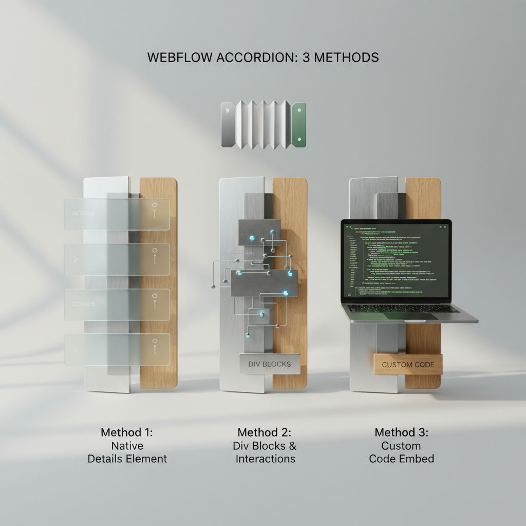
Most Webflow teams assume an accordion webflow build requires custom JavaScript or a complex Interactions timeline, when Webflow actually offers three no-code paths: a native Dropdown repurposed as an accordion, a custom HTML
For most teams shipping FAQs, feature lists, and content toggles quickly, the repurposed native Dropdown is the fastest method because it ships with built-in open/close state and styling and requires no extra structure.
In Webflow, an accordion is simply a list of headers that expand to reveal hidden copy, used to keep long answers, pricing details, and feature explanations scannable without stretching the page.
The details/summary method is the lightest semantic HTML option, while the Div blocks + Interactions method gives you complete control over layout and animation at the cost of more manual setup.
The difference shows up in keyboard behavior, animation control, and build time, so comparing all three on identical criteria is the smartest way to pick before you start.
An accordion in Webflow must still meet the WAI-ARIA Authoring Practices requirement that headers use an element with role button with aria-expanded set to true when the panel is visible and false when hidden, and that Enter or Space toggles panels while Tab moves focus to the next focusable element. Webflow's own implementation leans on the Dropdown element which opens the dropdown list when clicked and closes it when a different part of the page is clicked, per its custom accordion guide.
Having named the three methods, this section puts them head-to-head on the criteria that actually decide which one to use: how much work it takes to build, what you get for accessibility out of the box, how the animation behaves, and how far you can push the design.
| Method | Setup effort | Accessibility (keyboard/screen reader) | Animation smoothness | Design flexibility | Best for |
|---|---|---|---|---|---|
| Dropdown repurposed as accordion | — | Partial - focusable toggle, but no aria-expanded or aria-controls without custom attributes | Good - Size height from fixed px to auto via Interactions, can cause layout shift if not timed | Medium-high - Webflow styles, icon rotation, but bound to Dropdown structure | Quick FAQs and marketing toggles where speed matters |
| details/summary custom element | Low - single Embed or custom element, no Interactions needed | High out of the box - native semantics, browser handles expanded state and keyboard | Instant by default - smooth height animation requires CSS workarounds | Low-medium - limited marker styling, harder to fully brand | Simple accessible FAQs, docs, compliance-driven content |
| Div blocks + Interactions | High - build trigger, panel, initial states, open and close animations manually | None out of the box - must add role button, aria-expanded, aria-controls, and Enter/Space handlers per WAI-ARIA | Highest control - can chain height auto, opacity, rotate; still needs careful auto height handling | Highest - any layout, nested elements, full design system freedom | Custom designed accordions where visual control outweighs extra work |
The Dropdown repurpose scores lowest on setup effort because the open and close behavior exists without code, but you still have to change the default styles to make it behave like an accordion. The guide specifically tells you to set the Dropdown list Position to static so content around it makes room instead of overlaying, and to create a Size animation that sets height to auto matched to the toggle height.
The details/summary approach flips the trade. You get native semantics and keyboard handling from the browser with no ARIA wiring, which aligns with the W3C advice to maximize semantic HTML, but you lose fine animation control. Native browser open is instant; animating height from 0 to auto requires extra CSS or JS workarounds and styling the default marker is limited.
Div blocks plus Interactions gives you complete visual freedom. You build the trigger, the panel, and two timed animations yourself, so you can animate height, opacity, and icon rotation together. The cost is accessibility: out of the box a div has no button role, no aria-expanded, and no aria-controls, and no Enter or Space handling, so you must add all of those manually to meet the WAI-ARIA accordion pattern.
For most FAQ and content-toggle builds, default to the native Dropdown method for speed and decent flexibility, use details/summary when you prioritize native accessibility and minimal maintenance, and reserve Div + Interactions for cases where custom design outweighs the extra accessibility work.
Accordion webflow builds fail in the same place: you drop an element and the panel overlaps content instead of pushing it down. Fixing that requires changing the Dropdown List from Absolute to Static, setting Overflow to Hidden, and animating Height from your toggle height to Auto. With a method chosen, here is exactly how to build it, step by step.
This is the path documented in Webflow's custom accordion guide.
The simultaneous timestamp and the hidden overflow prevent the flicker where content shows through during the height transition.
Once a static accordion works, the next question is making it dynamic from CMS data.
Accessible, SEO-safe accordions in Webflow require keyboard operability and correct ARIA state like aria-expanded and aria-controls, and their hidden panel content remains crawlable when it stays in the DOM.
| Field | What to enter | Example |
|---|---|---|
| Trigger ID | Unique ID per CMS item, based on slug | faq-return-policy-trigger |
| Trigger attributes | role, aria-expanded, aria-controls | role="button" aria-expanded="false" aria-controls="faq-return-policy-panel" tabindex="0" |
| Panel ID | Must match aria-controls | faq-return-policy-panel |
| Panel labelling | aria-labelledby pointing to trigger, optional region role | role="region" aria-labelledby="faq-return-policy-trigger" |
| CMS Question binding | Plain text field to trigger | What is your return policy? |
| CMS Answer binding | Rich text field to panel | We accept returns with original receipt. |
A working accordion still needs to be accessible, crawlable, and reusable across CMS content, not just visually functional.
The independent standard is the WAI-ARIA accordion pattern. It specifies the title of each header is contained in an element with role button wrapped in an element with role heading that has an appropriate aria-level. If the panel is visible, aria-expanded is set to true, and if not visible, false. The header button has aria-controls set to the ID of the panel content. Optionally each panel container has role region and aria-labelledby referring to the controlling button.
Keyboard interaction defined by that pattern is simple: Enter or Space expands a collapsed panel or collapses an expanded one, and Tab moves focus to the next focusable element in page order.
What this means per Webflow method:
When you hide panel content with display:none or height:0 plus overflow:hidden, the markup is still present in the page source, so crawlers can discover it. Problems start when you remove content from the DOM entirely or load answers only after click via JavaScript fetch. Keep question text as real text in a button or heading, keep answers in the initial HTML, and do not rely on background images for copy. Once the component is accessible, the surrounding explanatory copy is what helps the page earn citations, as covered in this guide to getting cited in AI answers without enterprise budgets.
Create a CMS Collection with Question as plain text and Answer as rich text. Add a Collection List to your FAQ page and connect it to that Collection. Inside one Collection Item, build a single accordion row. Bind the Question field to the header button text and the Answer field to the panel. Give each pair a unique ID based on the item slug, for example faq-return-policy-trigger and faq-return-policy-panel, so aria-controls stays valid when Webflow repeats the row for every item. Set initial aria-expanded to false and control visibility with CSS rather than deleting nodes.
Use this template to keep attributes consistent:
| Field | What to enter | Example |
|---|---|---|
| Trigger ID | Unique ID per CMS item, based on slug | faq-return-policy-trigger |
| Trigger attributes | role, aria-expanded, aria-controls | role="button" aria-expanded="false" aria-controls="faq-return-policy-panel" tabindex="0" |
| Panel ID | Must match aria-controls | faq-return-policy-panel |
| Panel labelling | aria-labelledby pointing to trigger, optional region role | role="region" aria-labelledby="faq-return-policy-trigger" |
| CMS Question binding | Plain text field to trigger | What is your return policy? |
| CMS Answer binding | Rich text field to panel | We accept returns with original receipt. Contact support for details. |
Warning: An accordion built only with Interactions on Div blocks is not keyboard or screen-reader accessible by default. You must manually add role="button", tabindex="0", aria-expanded, and aria-controls and update aria-expanded on toggle.
Webflow forum users fixed overlapping accordion FAQ sections by changing the Dropdown List Position to Static and setting the parent Overflow to Hidden, the classic overlap bug in accordion Webflow builds.
HarperFlow publishes highly structured articles featuring FAQs, data tables, and direct-answer blocks that meet the rigorous citation standards required by AI search engines. By continuously auditing and improving your content through AI answer analytics, HarperFlow helps your site build long-term authority and visibility that outlasts ad-dependent strategies.
Building it correctly gets you most of the way there, but confirming it actually behaves as intended is what closes the loop.
Run these four checks before you ship:
1. Height animation jump Open DevTools, expand each panel, and watch the page behind it. If content below jumps or flashes, your answer wrapper is animating height:auto without Overflow Hidden. Set the answer div to Overflow Hidden and animate max-height or use Webflow's built-in open/close state instead of forcing height:auto.
2. Overlap because Position wasn't reset This is the most posted Webflow accordion bug. Select the Dropdown List element, go to Style > Position, set it to Static, then select the parent Dropdown and set Overflow to Hidden. Publish and reload, collapsed panels should no longer sit on top of each other.
3. Keyboard and state Tab through with only a keyboard. Each trigger should receive focus, Enter/Space should open it, and the aria-expanded value should toggle from false to true in the inspector. If focus skips or aria-expanded never changes, your interaction is only handling click, not keyboard.
4. Mobile touch targets On a phone or responsive preview, try tapping the triggers with a thumb. Triggers smaller than the W3C target size guidance feel missable and fail AAA criteria that requires at least 44 by 44 CSS pixels. Give the trigger button 44px min-height and adequate padding, not just icon-sized text.
If you want a working FAQ live today, default to the fastest reliable winner called out in the comparison (the native Dropdown repurposed as accordion) and only move to a Div + Interactions build when you need specific animation or layout control that Dropdown cannot deliver.
Once components like this are built well, what compounds a Webflow site's long-term visibility is keeping the surrounding articles fresh, structured, and easy to cite. For teams that don't want that upkeep to be manual, HarperFlow automates that publishing layer on Webflow without turning your blog into prompt-work.
It overlaps when the Dropdown List is still on its default absolute position. Select the Dropdown List and set Position to static, then set the parent Dropdown Overflow to hidden so surrounding content makes room when expanded, as shown in Webflow's custom accordion guide.
The native Dropdown closes when a different part of the page is clicked, but it does not auto-close siblings in the same list. To get single-open behavior you need an extra Interaction that closes other panels on click. The Divs + Interactions method gives you the most control for that logic.
Give each header role="button", aria-expanded="false" that toggles to true when visible, and aria-controls set to the ID of its panel per the WAI-ARIA accordion pattern. Optionally add role="region" and aria-labelledby on the panel pointing to the header. You must also wire keyboard handlers for Enter and Space.
Yes, if the answer stays in the DOM and is hidden with height, overflow:hidden, or display, crawlers can still discover it. Issues start when you remove nodes from the DOM or load answers only after click via fetch. Keep question and answer text in the initial HTML.
Create plain text Question and rich text Answer fields, then generate unique IDs from the slug like faq-return-policy-trigger and faq-return-policy-panel. Bind the trigger's aria-controls to the matching panel ID and keep the panel ID in sync. Start each trigger with aria-expanded="false" and hide with CSS rather than deleting nodes.
By default the browser opens details instantly with no transition. Animating height from 0 to auto needs CSS workarounds like max-height or grid animation, which adds maintenance. Use the Dropdown or Div + Interactions methods if you need timed height, opacity, and icon rotation together.
Flicker usually comes from animating to auto while overflow is visible. Set the parent Dropdown Overflow to hidden and run Size height auto and icon Rotate at the same timestamp. Matching the initial state height to your toggle, for example 80px, keeps the transition steady.
Follow the pattern where each header is focusable, Enter or Space toggles a panel, and Tab moves to the next focusable element. The details/summary element provides this natively. The Dropdown method gives focus but needs ARIA testing, and pure divs need tabindex="0" and manual key handlers.